
A portfolio is where visitors decide if they want to hire you.
Here's how to build a filterable portfolio in WordPress: your projects in a modern grid, filter buttons by category, and a lightbox that tells each project with images, sliders, videos and details.

Quick answer: WordPress has no portfolio with filters built in. With Media Grid you can make one in four steps:
- create your categories, for example "Branding", "Web design", "Photography"
- add a grid item for each project, with its cover, its category and what it opens: an image, a slider, a video or a link
- compose the grid in the Grid Builder, choosing the size of each item, for desktop and for mobile
- publish it with filters on, using the Gutenberg block, the Elementor widget or the
[ mediagrid]shortcode
What makes a good filterable portfolio
A filterable portfolio shows all your work on one page, with a row of buttons on top: "All", "Branding", "Web design", "Photography". A click shows only the projects of that category, without reloading the page.
The best portfolios add three more things:
- A grid with a rhythm: big items for your best projects, small ones for the rest, not a flat list of identical squares
- Different media: a project can be a photo, a set of images, a video or a link to a case study
- Details without leaving the page: a click opens the project in a lightbox, with text, client, year and the rest of the images
This is exactly what Media Grid was built for.
Ways to build a portfolio in WordPress, compared
| Category filters | Mixed media (images, sliders, videos) | Free layout | |
|---|---|---|---|
| WordPress gallery block | No | Images only | Columns only |
| Theme portfolio pages | Sometimes | Depends on the theme, lost if you change it | Fixed by the theme |
| Page builder portfolio widgets | Yes | Usually one type per widget | Fixed columns |
| Media Grid | Yes, plus search and pagination | Images, sliders, videos, audio, links, text | Each item sized freely, masonry |
One more reason to keep the portfolio in a plugin: your projects stay in place when you change theme.
Step 1: create the categories
- Go to Media Grid → Item Categories
- Create one category for each type of work you want as a filter, for example "Branding", "Web design", "Photography", "Video"
Keep them few and clear: five or six filters are easier to use than twenty. A project can belong to more than one category.
Step 2: add your projects
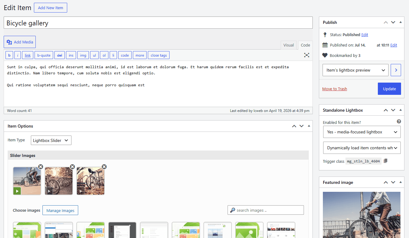
Each project is a grid item. Go to Media Grid → Add New Item:
- Write the title and, in the editor, the text that will appear in the lightbox: the brief, what you did, the result
- Set the featured image: it's the cover of the project in the grid
- Tick its Item Categories on the right
- In the Item Options box choose the Item Type, which decides what happens on click
- Publish
The item types that work best for a portfolio:
- Lightbox Image: a single big image, with the text beside or under it
- Lightbox Slider: several images of the same project, for example the logo, the business cards and the website
- Lightbox Video: a YouTube, Vimeo or Dailymotion video, or one from your Media Library. More in the WordPress video gallery guide
- Link: the cover leads to a full case study page, in the same or in a new tab
- Static Image, Inline Slider and Inline Video: they live inside the grid itself, great to give it movement
Try it with your own projects: start your free 7-day trial and have your filterable portfolio online in an afternoon.
Step 3: compose the grid
This is where Media Grid is different from any column gallery: you decide the size of every single item.
- Go to Media Grid → Grid Builder, write a name in Add New Grid and save it
- In Add Grid Items, choose Media Grid items - Item categories as items source, filter by category or search, and click the projects to add them
- Drag the items in the order you want
- Set the width and height of each item, from 1/12 to the full row, or "auto" height. Give your best projects the biggest spaces
- Switch to mobile view and set the sizes for phones, so the grid is designed for small screens too, not just squeezed
- Keep Layout mode on masonry (fill gaps): items fill the empty spaces automatically
- Save the grid
Many projects? Use Bulk items width and Bulk items height to size them all at once, then change only the ones you want to stand out.
Step 4: publish it with filters
Add the grid to your portfolio page with the Media Grid Gutenberg block or Elementor widget, and turn on the filters. Divi, WPBakery and Cornerstone are supported too. Or use the shortcode:
[ mediagrid gid="12" filter="1"]Useful options, all available in the block and widget too:
search="1"adds a search bar next to the filtersfilters_align="left"or"right"moves the filters to a side column, the classic agency lookdef_filter="5"opens the portfolio already filtered on category 5, for example "Branding" on your branding service pagehide_all="1"removes the "All" button
Reusing the same grid with a different default filter on each service page is an easy win: every page shows relevant work, and you manage the projects in one place.
Show project details in the lightbox
The lightbox is where a visitor becomes a client, so give it the details clients look for:
- Item Attributes: in Media Grid → Settings → Item Attributes create fields with an icon, like "Client", "Year", "Services" or "Location". Each item gets them to fill, and they appear in the lightbox
- Layouts: text under the media, or on the side with one third or half of the width
- Share buttons: Facebook, X, Pinterest and WhatsApp
- Direct links: with Deeplinking every opened project gets its own URL. You can send a client the link to a single project, and it opens right in the lightbox
Every project with a lightbox is also listed, with its direct link and cover image, in the Media Grid items XML sitemap. You find its address in Settings → Main Options → Deeplinking: set XML sitemap - items base-url to your portfolio page URL (by default it's the homepage), then submit the sitemap to Search Console, so search engines find each project.
Style the filters
All in Media Grid → Settings → Main Options → Item Filters - Search - Pagination Elements:
- Use textual filters style?: simple text links with a separator, instead of buttons
- Use dropdown on mobile mode?: on phones the filters become a dropdown
- Show counter related to filter matchings?: shows how many projects each category has
- "all" filter's text: rename it "Everything" or "All projects"
- Filtered items behavior: hide and reorder the other items, or just fade them
Colors are in the Colors tab, and the Preset Styles give you a complete look in one click.
Need more than one filter?
Category buttons cover most portfolios. When visitors need to combine criteria, for example "Interior design" + "Milan" + "2025", the Advanced Filters add-on lets you build complete filter panels:
- in Media Grid → Filter Sections create your own sections, like "Location" or "Year", as single option, multi-option, numeric range or colors list, each with its icon. Your Item Categories and the existing WordPress taxonomies are ready to use too
- give each project its values in the Advanced Filters Add-on box of the item editor
- in Media Grid → Filters Builder combine sections, search and sorting (by title or by date) in one filter, and choose its layout: on top as blocks, on top behind a "button-to-filters", or in a side column, also sticky while scrolling
- choose whether options of the same section show items matching all the chosen options, or at least one
- on phones the filters can switch to the compact "button-to-filters" layout
Then pick the filter in the Media Grid block or widget. Chosen options and sorting go in the URL too, so a filtered portfolio can be shared.
Design the covers with the Overlay Manager
The cover is the first thing visitors see. The Overlay Manager add-on gives you a visual builder for the overlays that appear on the covers:
- combine layers, shapes, icons, text blocks, buttons and social buttons, with entrance effects like curtain, door, zoom or "on mouse direction"
- apply image effects on hover: zoom, grayscale, blur, sepia, brightness and more
- show the project title, its excerpt and even its Item Attributes, like client or year, with the
[ mgom-item-attr name="Client"]shortcode - swap the cover with a second image on hover, set in the Media Grid - Overlay Image box of each item
- set a Default overlay for every grid, or a different one per grid
Both add-ons are included in the Media Grid Bundle Pack.
Real-world examples
- Designers and agencies: branding, web and print projects, each with a slider of the deliverables
- Architects and interior designers: projects filtered by type, with Item Attributes for location, year and square meters
- Photographers and videomakers: photos and showreels in the same grid, filtered by genre
- Musicians and labels: albums and tracks with audio players, next to videos and photos
- Builders and craftsmen: before and after photos, filtered by service, with a link to the quote form
Frequently asked questions
Can I use my existing posts or WooCommerce products as portfolio items?
Yes. In the Grid Builder you can add items from your post types, products included, and in dynamic mode the grid fills itself with the latest posts of a category: see how to create a WordPress posts grid. WooCommerce products even get an "Add to cart" button in the lightbox, like a WooCommerce quick view.
Can visitors save the projects they like?
Yes. Turn on the bookmarking system and a heart appears on each project, with a filter to see the saved ones. See how to add favorites to WordPress.
Does filtering reload the page?
No, it's instant. With deeplinking on, the URL updates too, so a filtered portfolio can be shared.
Is the portfolio mobile friendly?
Yes. Beyond being responsive, every item has its own mobile size, set by you in the Grid Builder, and filters can become a dropdown on phones.
Will my portfolio survive a theme change?
Yes. Items and grids belong to Media Grid, not to the theme, so they stay the same when you change theme.