Superlight vanilla JavaScript dropdowns
- sigle 20KB file, no dependencies, 100% pure javascript
- two themes (light, dark) included. Designed to be themed with no efforts
- themes mix support using prefixed selectors
- supports both simple and multiple select fields
- fully responsive, fits in any width
- (optional) default placeholder for simple select fields
- (optional) searchbar with minimum fields threshold
- (optional) maximum selectable options
- complete keyboard events integration
- option images support
- mobile ready
- multilanguage ready
Basic Implementation
					<!doctype html>
<html>
    <head>
        <link href="themes/light.css" rel="stylesheet" type="text/css">
    </head>
    <body>
        <form>
           <label>Simple (with images)</label>
            <select name="simple">
                <optgroup label="Europe">
                    <option value="ita">Italy</option>
                    <option value="fra" disabled>France</option>
                    <option value="esp">Spain</option>
                </optgroup>
                <optgroup label="Asia">
                    <option value="jap">Japan</option>
                    <option value="kor">Korea</option>
                    <option value="chn" disabled>China</option>
                </optgroup>
            </select>

            <label>Multiple</label>
            <select name="multiple" multiple>
                <option value="lorem">Lorem</option>
                <option value="ipsum" selected>Ipsum</option>
                <option value="dolor">Dolor</option>
            </select>
        </form>

        <script src="lc_select.min.js" type="text/javascript"></script>

        <script type="text/javascript">
        new lc_select('select');
        </script>
    </body>
</html>
Full-feature Implementation
<form>
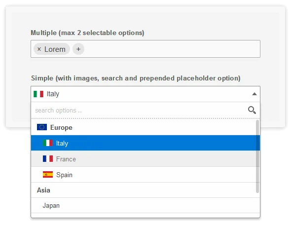
<label>Simple (with images, search and prepended placeholder option)</label>
<select name="simple" data-placeholder="Select something please .." autocomplete="off">
<optgroup label="Europe" data-image="demo-img/eu.svg">
<option value="ita" data-image="demo-img/ita.svg">Italy</option>
<option value="fra" data-image="demo-img/fra.png" disabled>France</option>
<option value="esp" data-image="demo-img/esp.png">Spain</option>
</optgroup>
<optgroup label="Asia">
<option value="jap">Japan</option>
<option value="kor">Korea</option>
<option value="chn" disabled>China</option>
</optgroup>
</select>
<label>Multiple (max 2 selectable options)</label>
<select name="multiple" data-placeholder="What a nice placeholder" multiple>
<option value="lorem">Lorem</option>
<option value="ipsum" selected>Ipsum</option>
<option value="dolor">Dolor</option>
</select>
</form>
<script type="text/javascript">
new lc_select('select[name="simple"]', {
wrap_width: '100%',
min_for_search: 3,
pre_placeh_opt: true,
});
new lc_select('select[name="multiple"]', {
wrap_width : '100%',
enable_search : false,
max_opts : 2,
});
</script>
Mixing themes
The easiest and cleanest way to mix themes on the same webpage is
- using addit_classes option to specify the theme prefix
- include prefixed themes version (there are prefixed versions of dark/ligh themes in the “themes” folder)
					<link href="themes/light_prefixed.css" rel="stylesheet" type="text/css">
<link href="themes/dark_prefixed.css" rel="stylesheet" type="text/css">

<script type="text/javascript>
new lc_select('.select-class-light', {
    addit_classes : ['lcslt-light']
});

new lc_select('.select-class-dark', {
    addit_classes : ['lcslt-dark']
});
</script>
Options
Here are listed available options with default values
					new lc_select('select', {

    // (bool) whether to enable fields search
    enable_search : true,

    // (int) minimum options number to show search
    min_for_search : 7,

    // (bool) whether to automatically focus search field on desktop (NB: will break tabindex chain)
    autofocus_search: false,

    // (string) defines the wrapper width: "auto" to leave it up to CSS, "inherit" to statically copy input field width, or any other CSS sizing
    wrap_width : 'auto',

    // (array) custom classes assigned to the field wrapper (.lcslt-wrap) and dropdown (#lc-select-dd)
    addit_classes : [],

    // (bool) if true, on simple dropdowns without a selected value, prepend an empty option using placeholder text
    pre_placeh_opt : false,

    // (int|false) defining maximum selectable options for multi-select
    max_opts : false,

    // (function) triggered every time field value changes. Passes value and target field object as parameters
    on_change : null, // function(new_value, target_field) {},

    // (array) option used to translate script texts
    labels : [
        'search options',
        'add options',
        'Select options ..',
        '.. no matching options ..',
    ],
});
Public Events
Alternatively to the “on_change” option, you can use the native “change” element event to track field changes
					<script type="text/javascript">
document.querySelectorAll('select').forEach(function(el) {
   el.addEventListener('change', ..etc.. );
});
</script>
Extras
There are two extra events you can trigger on initialized elements:
lc-select-refresh: re-sync select field options and status with plugin instance (eg. when new fields are dynamically added)
lc-select-destroy: remove plugn instance, coming back to HTML select field
					<script type="text/javascript">
const select = document.querySelector('select');

// initialize
new lc_select(select);

// re-sync
const resyncEvent = new Event('lc-select-refresh');
select.dispatchEvent(resyncEvent);

// destroy
const destroyEvent = new Event('lc-select-destroy');
select.dispatchEvent(destroyEvent);
</script>